WPF Textbox Rounded Corners.
Using WPF Textbox style options we can make a WPF Textbox with Rounded corners. We can also make radius of all four corners differently using the border radius property of WPF Textbox styling. Here we will be using the same.
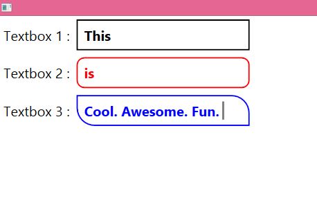
Below is the style code for WPF Textbox. I have made three different Textbox to explain the styling of WPF Textbox with different rounded corner options.
WPF Style Code :
<Style TargetType="TextBox" x:Key="Textbox">
<Setter Property="Padding" Value="7"/>
<Setter Property="Margin" Value="5"/>
<Setter Property="Foreground" Value="#000"/>
<Setter Property="FontSize" Value="20"/>
<Setter Property="MinHeight" Value="20"/>
<Setter Property="MinWidth" Value="250"/>
<Setter Property="FontWeight" Value="Bold" />
<Setter Property="Template">
<Setter.Value>
<ControlTemplate TargetType="{x:Type TextBox}">
<Border x:Name="border"
CornerRadius="0"
BorderBrush="#000"
BorderThickness="2"
Background="#fff"
>
<ScrollViewer x:Name="PART_ContentHost"
Focusable="false"
HorizontalScrollBarVisibility="Hidden"
VerticalScrollBarVisibility="Hidden"/>
</Border>
<ControlTemplate.Triggers>
<Trigger Property="IsMouseOver" Value="true">
<Setter Property="BorderBrush" TargetName="border" Value="Red"/>
<Setter Property="Foreground" Value="Red" />
<Setter Property="FontWeight" Value="Bold" />
</Trigger>
<Trigger Property="IsFocused" Value="true">
<Setter Property="Foreground" Value="Blue" />
<Setter Property="BorderBrush" TargetName="border" Value="Blue"/>
</Trigger>
</ControlTemplate.Triggers>
</ControlTemplate>
</Setter.Value>
</Setter>
</Style>

<Style TargetType="TextBox" x:Key="Textbox1">
<Setter Property="Padding" Value="7"/>
<Setter Property="Margin" Value="5"/>
<Setter Property="Foreground" Value="#000"/>
<Setter Property="FontSize" Value="20"/>
<Setter Property="MinHeight" Value="20"/>
<Setter Property="MinWidth" Value="250"/>
<Setter Property="FontWeight" Value="Bold" />
<Setter Property="Template">
<Setter.Value>
<ControlTemplate TargetType="{x:Type TextBox}">
<Border x:Name="border"
CornerRadius="10"
BorderBrush="#000"
BorderThickness="2"
Background="#fff"
>
<ScrollViewer x:Name="PART_ContentHost"
Focusable="false"
HorizontalScrollBarVisibility="Hidden"
VerticalScrollBarVisibility="Hidden"/>
</Border>
<ControlTemplate.Triggers>
<Trigger Property="IsMouseOver" Value="true">
<Setter Property="BorderBrush" TargetName="border" Value="Red"/>
<Setter Property="Foreground" Value="Red" />

</Trigger>
<Trigger Property="IsFocused" Value="true">
<Setter Property="Foreground" Value="Blue" />
<Setter Property="BorderBrush" TargetName="border" Value="Blue"/>
</Trigger>
</ControlTemplate.Triggers>
</ControlTemplate>
</Setter.Value>
</Setter>
</Style>

<Style TargetType="TextBox" x:Key="Textbox2">
<Setter Property="Padding" Value="7"/>
<Setter Property="Margin" Value="5"/>
<Setter Property="Foreground" Value="#000"/>
<Setter Property="FontSize" Value="20"/>
<Setter Property="MinHeight" Value="20"/>
<Setter Property="MinWidth" Value="250"/>
<Setter Property="FontWeight" Value="Bold" />
<Setter Property="Template">
<Setter.Value>
<ControlTemplate TargetType="{x:Type TextBox}">
<Border x:Name="border"
CornerRadius="0,25,0,25"
BorderBrush="#000"
BorderThickness="2"
Background="#fff"
>
<ScrollViewer x:Name="PART_ContentHost"
Focusable="false"
HorizontalScrollBarVisibility="Hidden"
VerticalScrollBarVisibility="Hidden"/>
</Border>
<ControlTemplate.Triggers>
<Trigger Property="IsMouseOver" Value="true">
<Setter Property="BorderBrush" TargetName="border" Value="Red"/>
<Setter Property="Foreground" Value="Red" />

</Trigger>
<Trigger Property="IsFocused" Value="true">
<Setter Property="Foreground" Value="Blue" />
<Setter Property="BorderBrush" TargetName="border" Value="Blue"/>
</Trigger>
</ControlTemplate.Triggers>
</ControlTemplate>
</Setter.Value>
</Setter>
</Style>
WPF Textbox rounded corners usage :
<StackPanel Orientation="Vertical" VerticalAlignment="Top">

<StackPanel Orientation="Horizontal" VerticalAlignment="Top">
<TextBlock FontSize="20" Margin="5" VerticalAlignment="Center">Textbox 1 :</TextBlock>
<TextBox Name="btnName1" Style="{StaticResource Textbox}"></TextBox>
</StackPanel>
<StackPanel Orientation="Horizontal" VerticalAlignment="Top">
<TextBlock FontSize="20" Margin="5" VerticalAlignment="Center">Textbox 2 :</TextBlock>
<TextBox Name="btnName" Style="{StaticResource Textbox1}"></TextBox>
</StackPanel>
<StackPanel Orientation="Horizontal" VerticalAlignment="Top">
<TextBlock FontSize="20" Margin="5" VerticalAlignment="Center">Textbox 3 :</TextBlock>
<TextBox Name="btnLastName" Style="{StaticResource Textbox2}"></TextBox>
</StackPanel>
</StackPanel>
Complete Form :
<Window x:Class="WpfApplication2.Form2"
xmlns="http://schemas.microsoft.com/winfx/2006/xaml/presentation"
xmlns:x="http://schemas.microsoft.com/winfx/2006/xaml" WindowState="Maximized"
Title="Form2" Height="300" Width="300" Background="#fff" Foreground="#000">
<Window.Resources>
<Style TargetType="TextBox" x:Key="Textbox">
<Setter Property="Padding" Value="7"/>
<Setter Property="Margin" Value="5"/>
<Setter Property="Foreground" Value="#000"/>
<Setter Property="FontSize" Value="20"/>
<Setter Property="MinHeight" Value="20"/>
<Setter Property="MinWidth" Value="250"/>
<Setter Property="FontWeight" Value="Bold" />
<Setter Property="Template">
<Setter.Value>
<ControlTemplate TargetType="{x:Type TextBox}">
<Border x:Name="border"
CornerRadius="0"
BorderBrush="#000"
BorderThickness="2"
Background="#fff"
>
<ScrollViewer x:Name="PART_ContentHost"
Focusable="false"
HorizontalScrollBarVisibility="Hidden"
VerticalScrollBarVisibility="Hidden"/>
</Border>
<ControlTemplate.Triggers>
<Trigger Property="IsMouseOver" Value="true">
<Setter Property="BorderBrush" TargetName="border" Value="Red"/>
<Setter Property="Foreground" Value="Red" />
<Setter Property="FontWeight" Value="Bold" />
</Trigger>
<Trigger Property="IsFocused" Value="true">
<Setter Property="Foreground" Value="Blue" />
<Setter Property="BorderBrush" TargetName="border" Value="Blue"/>
</Trigger>
</ControlTemplate.Triggers>
</ControlTemplate>
</Setter.Value>
</Setter>
</Style>

<Style TargetType="TextBox" x:Key="Textbox1">
<Setter Property="Padding" Value="7"/>
<Setter Property="Margin" Value="5"/>
<Setter Property="Foreground" Value="#000"/>
<Setter Property="FontSize" Value="20"/>
<Setter Property="MinHeight" Value="20"/>
<Setter Property="MinWidth" Value="250"/>
<Setter Property="FontWeight" Value="Bold" />
<Setter Property="Template">
<Setter.Value>
<ControlTemplate TargetType="{x:Type TextBox}">
<Border x:Name="border"
CornerRadius="10"
BorderBrush="#000"
BorderThickness="2"
Background="#fff"
>
<ScrollViewer x:Name="PART_ContentHost"
Focusable="false"
HorizontalScrollBarVisibility="Hidden"
VerticalScrollBarVisibility="Hidden"/>
</Border>
<ControlTemplate.Triggers>
<Trigger Property="IsMouseOver" Value="true">
<Setter Property="BorderBrush" TargetName="border" Value="Red"/>
<Setter Property="Foreground" Value="Red" />

</Trigger>
<Trigger Property="IsFocused" Value="true">
<Setter Property="Foreground" Value="Blue" />
<Setter Property="BorderBrush" TargetName="border" Value="Blue"/>
</Trigger>
</ControlTemplate.Triggers>
</ControlTemplate>
</Setter.Value>
</Setter>
</Style>

<Style TargetType="TextBox" x:Key="Textbox2">
<Setter Property="Padding" Value="7"/>
<Setter Property="Margin" Value="5"/>
<Setter Property="Foreground" Value="#000"/>
<Setter Property="FontSize" Value="20"/>
<Setter Property="MinHeight" Value="20"/>
<Setter Property="MinWidth" Value="250"/>
<Setter Property="FontWeight" Value="Bold" />
<Setter Property="Template">
<Setter.Value>
<ControlTemplate TargetType="{x:Type TextBox}">
<Border x:Name="border"
CornerRadius="0,25,0,25"
BorderBrush="#000"
BorderThickness="2"
Background="#fff"
>
<ScrollViewer x:Name="PART_ContentHost"
Focusable="false"
HorizontalScrollBarVisibility="Hidden"
VerticalScrollBarVisibility="Hidden"/>
</Border>
<ControlTemplate.Triggers>
<Trigger Property="IsMouseOver" Value="true">
<Setter Property="BorderBrush" TargetName="border" Value="Red"/>
<Setter Property="Foreground" Value="Red" />

</Trigger>
<Trigger Property="IsFocused" Value="true">
<Setter Property="Foreground" Value="Blue" />
<Setter Property="BorderBrush" TargetName="border" Value="Blue"/>
</Trigger>
</ControlTemplate.Triggers>
</ControlTemplate>
</Setter.Value>
</Setter>
</Style>

</Window.Resources>
<StackPanel Orientation="Vertical" VerticalAlignment="Top">

<StackPanel Orientation="Horizontal" VerticalAlignment="Top">
<TextBlock FontSize="20" Margin="5" VerticalAlignment="Center">Textbox 1 :</TextBlock>
<TextBox Name="btnName1" Style="{StaticResource Textbox}"></TextBox>
</StackPanel>
<StackPanel Orientation="Horizontal" VerticalAlignment="Top">
<TextBlock FontSize="20" Margin="5" VerticalAlignment="Center">Textbox 2 :</TextBlock>
<TextBox Name="btnName" Style="{StaticResource Textbox1}"></TextBox>
</StackPanel>
<StackPanel Orientation="Horizontal" VerticalAlignment="Top">
<TextBlock FontSize="20" Margin="5" VerticalAlignment="Center">Textbox 3 :</TextBlock>
<TextBox Name="btnLastName" Style="{StaticResource Textbox2}"></TextBox>
</StackPanel>
</StackPanel>
</Window>
After using the above code, you can run your program to make three different looking WPF textbox with rounded corners. They will be also having the property of on-focus, hovering color change, foreground color change and border color change using the above WPF Textbox style code.
Also see :
- WPF – DataGrid with Buttons and its Clicking method – Get Row Data with WPF DataGrid Buttons
- WPF – Using DataGrid Row MouseDoubleClick for getting row Data – Example
- WPF – Designing Material Design Tabs in WPF using Dragablz
- WPF – Bind ComboBox using MS SQL database
- WPF Textbox changing Focus Style Background Colors.
- WPF – Bind DataGrid using SQL Database
- WPF Button Style with Rounded Corners and Hover Effects
- WPF Textbox Style – Changing Colors on Focus
Pingback: WPF Textbox Style - Changing Colors on Focus • ParallelCodes();
Pingback: WPF Styling TabControl and TabItem • ParallelCodes();
Thumbs up <3
Pingback: WPF Datagrid with Button and Click Method - ParallelCodes