
In this post let’s see how we can style our WPF TabContol and its TabItem. WPF TabControl allows us to divide our interface into multiple tabs which our users will find convenient to use rather than a comple WPF Page or a Window. So let’s see how we can design it.
WPF Style TabControl and TabItem:
In your WPF Window .xaml create a <Window.Resource> tag below and add following styles to it.
MainWindow.xaml: StyleCode-
<Window.Resources>
<Style TargetType="{x:Type TabControl}">
<Setter Property="TabStripPlacement" Value="Top" />
<Setter Property="Margin" Value="0" />
<Setter Property="Padding" Value="0"/>
</Style>

<Style TargetType="TabItem">
<Setter Property="FontSize" Value="10"/>
<Setter Property="BorderBrush" Value="Pink"/>
<Setter Property="BorderThickness" Value="10"/>
<Setter Property="Template">
<Setter.Value>
<ControlTemplate TargetType="{x:Type TabItem}">
<Border x:Name="PART_Border" Background="{TemplateBinding Background}" BorderThickness="1,1,1,0"
BorderBrush="Black" Margin="0,0,0,0" CornerRadius="2,2,0,0" Padding="50,0,50,0">
<ContentPresenter ContentSource="Header" Margin="5" />
</Border>
<ControlTemplate.Triggers>
<Trigger Property="IsSelected" Value="True">
<Setter Property="Background" Value="#fff291"/>
<Setter Property="Foreground" Value="#000"/>
</Trigger>

<Trigger Property="IsSelected" Value="false">
<Setter Property="Background" Value="#013284"/>
<Setter Property="Foreground" Value="#fff"/>

</Trigger>
</ControlTemplate.Triggers>

</ControlTemplate>
</Setter.Value>
</Setter>
</Style>
</Window.Resources>
And Create a TabControl and its TabItem like below :
TabControl :
<TabControl>
<TabItem Name="TabItem1" Header="Tab 1" >
<StackPanel Background="White" Height="500" Orientation="Vertical">
<StackPanel Background="#fff291" Height="5"/>
<TextBlock FontSize="25" Padding="25" Foreground="#013284" FontWeight="ExtraBold" >Tab 1</TextBlock>
</StackPanel>
</TabItem>

<TabItem Header="Tab 2" Name="TabItem2" >
<StackPanel Background="White" Height="500" Orientation="Vertical">
<StackPanel Background="#fff291" Height="5"/>
<TextBlock FontSize="25" Padding="25" Foreground="#013284" FontWeight="ExtraBold" >Tab 2</TextBlock>
</StackPanel>
</TabItem>

<TabItem Header="Tab 3" Name="TabItem3" >
<StackPanel Background="White" Height="500" Orientation="Vertical">
<StackPanel Background="#fff291" Height="5"/>
<TextBlock FontSize="25" Padding="25" Foreground="#013284" FontWeight="ExtraBold" >Tab 3</TextBlock>
</StackPanel>
</TabItem>

<TabItem Header="Tab 4" Name="TabItem4" >
<StackPanel Background="White" Height="500" Orientation="Vertical">
<StackPanel Background="#fff291" Height="5"/>
<TextBlock FontSize="25" Padding="25" Foreground="#013284" FontWeight="ExtraBold" >Tab 4</TextBlock>
</StackPanel>
</TabItem>

<TabItem Header="Tab 5" Name="TabItem5">
<StackPanel Background="White" Height="500" Orientation="Vertical">
<StackPanel Background="#fff291" Height="5"/>
<TextBlock FontSize="25" Padding="25" Foreground="#013284" FontWeight="ExtraBold" >Tab 5</TextBlock>
</StackPanel>
</TabItem>
</TabControl>
Now, run your application.
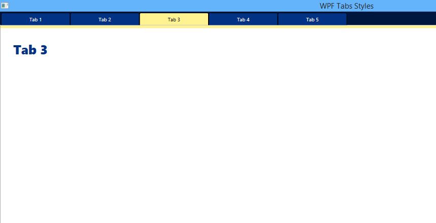
Full Page :
MainWindow.xaml:
<Window x:Class="WpfApplication1.MainWindow"
xmlns="http://schemas.microsoft.com/winfx/2006/xaml/presentation"
xmlns:x="http://schemas.microsoft.com/winfx/2006/xaml"
Title="WPF Tabs Styles" Height="350" Width="525" WindowState="Maximized">
<Window.Resources>
<Style TargetType="{x:Type TabControl}">
<Setter Property="TabStripPlacement" Value="Top" />
<Setter Property="Margin" Value="0" />
<Setter Property="Padding" Value="0"/>
</Style>

<Style TargetType="TabItem">
<Setter Property="FontSize" Value="10"/>
<Setter Property="BorderBrush" Value="Pink"/>
<Setter Property="BorderThickness" Value="10"/>
<Setter Property="Template">
<Setter.Value>
<ControlTemplate TargetType="{x:Type TabItem}">
<Border x:Name="PART_Border" Background="{TemplateBinding Background}" BorderThickness="1,1,1,0"
BorderBrush="Black" Margin="0,0,0,0" CornerRadius="2,2,0,0" Padding="50,0,50,0">
<ContentPresenter ContentSource="Header" Margin="5" />
</Border>
<ControlTemplate.Triggers>
<Trigger Property="IsSelected" Value="True">
<Setter Property="Background" Value="#fff291"/>
<Setter Property="Foreground" Value="#000"/>
</Trigger>

<Trigger Property="IsSelected" Value="false">
<Setter Property="Background" Value="#013284"/>
<Setter Property="Foreground" Value="#fff"/>

</Trigger>
</ControlTemplate.Triggers>

</ControlTemplate>
</Setter.Value>
</Setter>
</Style>
</Window.Resources>
<StackPanel Orientation="Vertical">

<StackPanel Background="#00173d" Orientation="Vertical">
<TabControl>
<TabItem Name="TabItem1" Header="Tab 1" >
<StackPanel Background="White" Height="500" Orientation="Vertical">
<StackPanel Background="#fff291" Height="5"/>
<TextBlock FontSize="25" Padding="25" Foreground="#013284" FontWeight="ExtraBold" >Tab 1</TextBlock>
</StackPanel>
</TabItem>

<TabItem Header="Tab 2" Name="TabItem2" >
<StackPanel Background="White" Height="500" Orientation="Vertical">
<StackPanel Background="#fff291" Height="5"/>
<TextBlock FontSize="25" Padding="25" Foreground="#013284" FontWeight="ExtraBold" >Tab 2</TextBlock>
</StackPanel>
</TabItem>

<TabItem Header="Tab 3" Name="TabItem3" >
<StackPanel Background="White" Height="500" Orientation="Vertical">
<StackPanel Background="#fff291" Height="5"/>
<TextBlock FontSize="25" Padding="25" Foreground="#013284" FontWeight="ExtraBold" >Tab 3</TextBlock>
</StackPanel>
</TabItem>

<TabItem Header="Tab 4" Name="TabItem4" >
<StackPanel Background="White" Height="500" Orientation="Vertical">
<StackPanel Background="#fff291" Height="5"/>
<TextBlock FontSize="25" Padding="25" Foreground="#013284" FontWeight="ExtraBold" >Tab 4</TextBlock>
</StackPanel>
</TabItem>

<TabItem Header="Tab 5" Name="TabItem5">
<StackPanel Background="White" Height="500" Orientation="Vertical">
<StackPanel Background="#fff291" Height="5"/>
<TextBlock FontSize="25" Padding="25" Foreground="#013284" FontWeight="ExtraBold" >Tab 5</TextBlock>
</StackPanel>
</TabItem>
</TabControl>
</StackPanel>
</StackPanel>
</Window>
Thank You.
Also see :
- WPF – DataGrid with Buttons and its Clicking method – Get Row Data with WPF DataGrid Buttons
- WPF – Using DataGrid Row MouseDoubleClick for getting row Data – Example
- WPF – Designing Material Design Tabs in WPF using Dragablz
- WPF – Bind ComboBox using MS SQL database
- WPF Textbox with Rounded Corners
- WPF Textbox changing Focus Style Background Colors.
- WPF – Bind DataGrid using SQL Database
- WPF Button Style with Rounded Corners and Hover Effects
- WPF Textbox Style – Changing Colors on Focus
- WPF ComboBox SelectionChanged – SelectedItem Method