In previous post on Xamarin Forms we saw How to create and write to a text file, here we will create a Xamarin Forms Button control with Custom Icons and custom controls. The button will have an Image as an Icon and also will have Commands. We will use Xamarin Forms MVVM pattern to perform the click events on our Image button. Upon pressing the button, we will change Text on a Label control indicating which button was pressed. So let’s begin.
In your Xamarin forms project create a folder named CustomControls and create a ContentView xaml file with name MyButton.xaml.
CustomControls > MyButton.xaml:
<?xml version="1.0" encoding="UTF-8"?>
<ContentView xmlns="http://xamarin.com/schemas/2014/forms"
xmlns:x="http://schemas.microsoft.com/winfx/2009/xaml"
x:Class="XamarinCustomControls.CustomControls.MyButton">
<ContentView.Content>
<Frame CornerRadius="5" x:Name="myFrame" HorizontalOptions="Start" VerticalOptions="Start"
Margin="2" HasShadow="True" Padding="10" >

<StackLayout Orientation="Horizontal" BackgroundColor="Transparent" x:Name="stack">
<Image x:Name="btnIcon" HeightRequest="20" WidthRequest="20" HorizontalOptions="Start"
BackgroundColor="Transparent"/>
<Label x:Name="btnText" HorizontalOptions="Start" TextColor="#000" BackgroundColor="Transparent"
FontSize="16"/>
</StackLayout>
</Frame>
</ContentView.Content>
</ContentView>
Here, we are creating an Icon for our button using Image control and Text using Label control. We are using Frame so that we can provide border radius for our button.
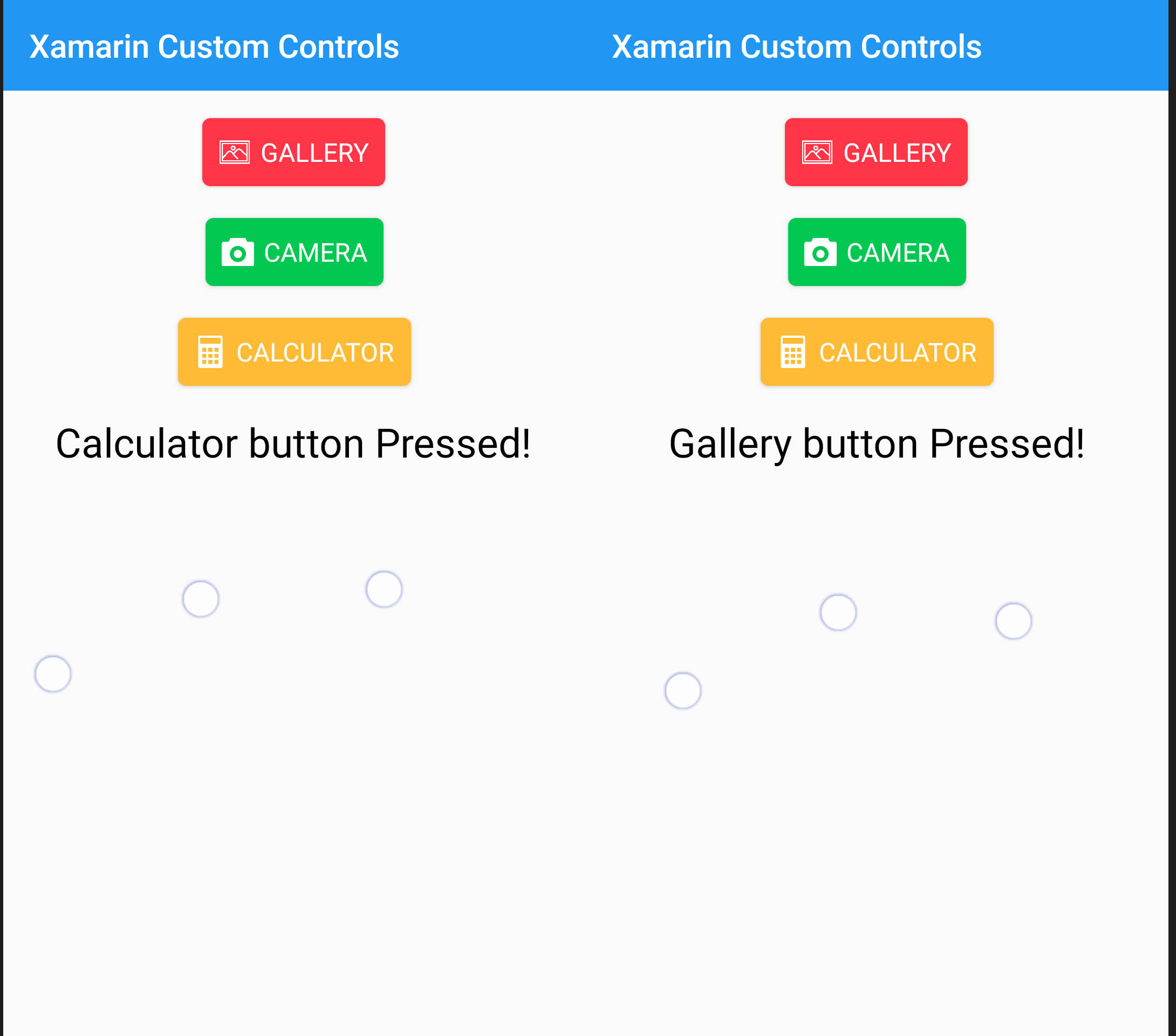
Xamarin Forms Custom Controls Custom Button with Icons
Edit the code behind as below:
CustomControls > MyButton.xaml.cs:
using System;
using System.Windows.Input;
using Xamarin.Forms;
using Xamarin.Forms.Xaml;

namespace XamarinCustomControls.CustomControls
{
[XamlCompilation(XamlCompilationOptions.Compile)]
public partial class MyButton : ContentView
{
public event EventHandler Clicked;
public static readonly BindableProperty ButtonText
= BindableProperty.Create(nameof(Text), typeof(string), typeof(MyButton));

public string Text
{
get => (string)GetValue(ButtonText);
set => SetValue(ButtonText, value);
}

public static readonly BindableProperty ButtonImage
= BindableProperty.Create(nameof(Image), typeof(string), typeof(MyButton));

public string Image
{
get => (string)GetValue(ButtonImage);
set => SetValue(ButtonImage, value);
}

public static readonly BindableProperty BgColor
= BindableProperty.Create(nameof(FrameBackgroundColor), typeof(string), typeof(MyButton), "#fff");

public string FrameBackgroundColor
{
get => (string)GetValue(BgColor);
set => SetValue(BgColor, value);
}

public static readonly BindableProperty TxtColor
= BindableProperty.Create(nameof(TextColor), typeof(string), typeof(MyButton), "#000");

public string TextColor
{
get => (string)GetValue(TxtColor);
set => SetValue(TxtColor, value);
}

public static readonly BindableProperty CommandProperty = BindableProperty.Create(nameof(Command),
typeof(ICommand), typeof(MyButton), null);

public ICommand Command
{
get => (ICommand)GetValue(CommandProperty);
set => SetValue(CommandProperty, value);
}

public static readonly BindableProperty CommandPropertyParam = BindableProperty.Create(nameof(CommandParam),
typeof(object), typeof(MyButton), null);

public object CommandParam
{
get => (object)GetValue(CommandPropertyParam);
set => SetValue(CommandPropertyParam, value);
}
public MyButton()
{
InitializeComponent();

this.GestureRecognizers.Add(new TapGestureRecognizer
{
Command = new Command(()=> {
Clicked?.Invoke(this, EventArgs.Empty);
if(Command!=null)
{
if (Command.CanExecute(CommandParam))
Command.Execute(CommandParam);
}
})

});
}
protected override void OnParentSet()
{
base.OnParentSet();
btnIcon.Source = Image;
btnText.Text = Text;
myFrame.BackgroundColor = Color.FromHex(FrameBackgroundColor);
btnText.TextColor = Color.FromHex(TextColor);

stack.BackgroundColor = Color.FromHex(FrameBackgroundColor);
btnText.BackgroundColor = Color.FromHex(FrameBackgroundColor);
btnIcon.BackgroundColor = Color.FromHex(FrameBackgroundColor);
}

}
}
We are creating Properties of BackgroundColor, TextColor, ImageSource for the icon and the CommandProperty for our button control. We will pass the CommandParameter parameter for each of our button so that we can perform according to the different buttons. Now we will use this custom control on our MainPage.
MainPage.xaml:
<?xml version="1.0" encoding="utf-8" ?>
<ContentPage xmlns="http://xamarin.com/schemas/2014/forms"
xmlns:x="http://schemas.microsoft.com/winfx/2009/xaml"
xmlns:controls="clr-namespace:XamarinCustomControls.CustomControls"
x:Class="XamarinCustomControls.MainPage"
BackgroundColor="#fafafa">

<StackLayout Padding="10" BackgroundColor="Transparent">

<!-- Place new controls here -->

<controls:MyButton Image="gallery.png" Text="GALLERY" HorizontalOptions="Center"
TextColor="#fff" FrameBackgroundColor="#ff3547" Margin="5"
Command="{Binding CmdGallery}" CommandParam="Gallery" />

<controls:MyButton Image="camera.png" Text="CAMERA" HorizontalOptions="Center"
TextColor="#fff" FrameBackgroundColor="#00c851" Margin="5"
Command="{Binding CmdGallery}" CommandParam="Camera"/>

<controls:MyButton Image="calculator.png" Text="CALCULATOR" HorizontalOptions="Center"
TextColor="#fff" FrameBackgroundColor="#ffbb33" Margin="5"
Command="{Binding CmdGallery}" CommandParam="Calculator"/>

<Label x:Name="infoMessage" Text="{Binding infoMessage}" Margin="5"
HorizontalOptions="CenterAndExpand" TextColor="#000" FontSize="25"/>
</StackLayout>

</ContentPage>
You will need to have three icons for our buttons. For Android copy inside drawable folder and for iOS project copy inside Resources folder. Now each button is having the same Command binding but we are passing different CommandParameter (CommandParam). We will create a ViewModel for our Page. Edit the code behind as below:
MainPage.xaml.cs:
using Xamarin.Forms;
using XamarinCustomControls.ViewModels;

namespace XamarinCustomControls
{
public partial class MainPage : ContentPage
{
public MainPage()
{
this.BindingContext = new VMMainPage();
InitializeComponent();
NavigationPage.SetHasNavigationBar(this, true);
this.Title = "Xamarin Custom Controls";
}
}
}
Now create a you folder in your project with name ViewModels and create a new class with name VMMainPage.cs
ViewModels > VMMainPage.cs:
using System;
using System.Collections.Generic;
using System.ComponentModel;
using System.Runtime.CompilerServices;
using System.Text;
using Xamarin.Forms;

namespace XamarinCustomControls.ViewModels
{
public class VMMainPage : INotifyPropertyChanged
{
private Command _cmdGallery { get; set; }

public Command CmdGallery
{
get { return _cmdGallery; }
set
{
_cmdGallery = value;
OnPropertyChanged();
}
}

private string _infoMessage { get; set; }
public string infoMessage
{
get { return _infoMessage; }
set
{
_infoMessage = value;
OnPropertyChanged();
}
}

public VMMainPage()
{
infoMessage = "Press any button";
CmdGallery = new Command<string>(execute: (string arg) =>
{
if (string.IsNullOrWhiteSpace(arg))
infoMessage = "Gallery button pressed!";
else
infoMessage = arg + " button Pressed!";
});
}
public event PropertyChangedEventHandler PropertyChanged;
protected void OnPropertyChanged([CallerMemberName] string propertyName = "")
{
var changed = PropertyChanged;
if (changed == null)
return;

changed.Invoke(this, new PropertyChangedEventArgs(propertyName));
}
}
}
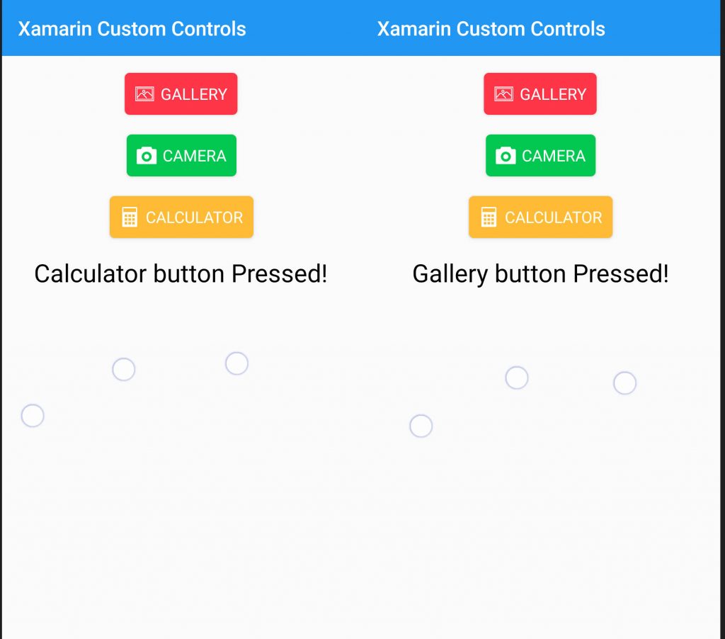
Xamarin Forms Custom Controls Custom Button with Icons